Explorentory
Daegeun Kim
Overview
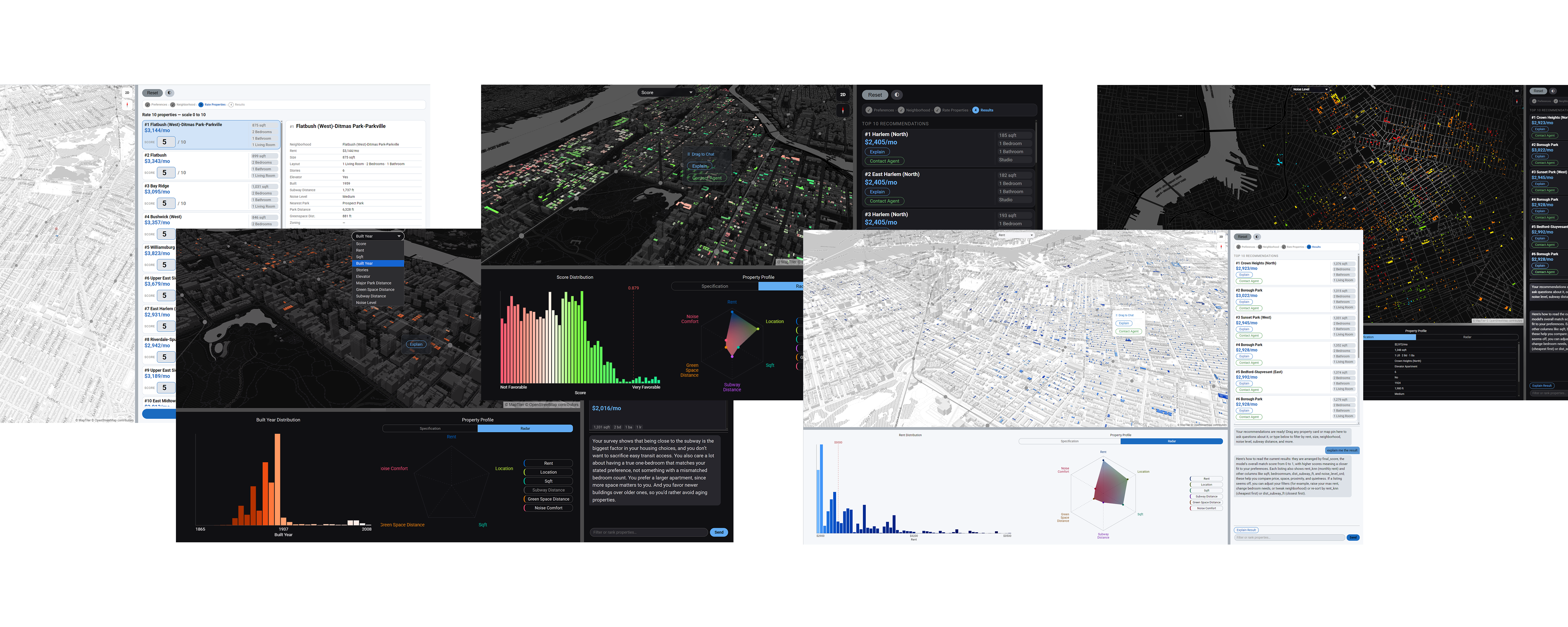
Explorentory is a full-stack, AI-powered NYC rental discovery platform. Rather than mimicking the filter-first paradigm of traditional real estate search, where users must commit to a price cap and bedroom count before seeing anything, Explorentory inverts the process. Users express natural-language preferences, explore a neighborhood on a live map, rate a curated sample of real properties, and receive personalized recommendations ranked by an OLS regression model trained on their own feedback. Three LLM-powered endpoints provide plain-English context at every stage. The platform operates on a PostGIS database of approximately 3 million synthetic NYC units derived from PLUTO and building data, with MapLibre GL rendering up to 5,000 results as an interactive choropleth map across 9 data dimensions.
Research Questions
01. AI-Driven Interaction
How can an LLM-assisted experience enable personalized rental recommendations in terms of dealing with ambiguity?
02. Machine Learning Customization
How can a high bias low variance machine learning model adapt rental recommendations with high efficiency based on user behavior, constraints, and urban data?
03. Visualization & Experience Design
How can interactive visualizations clarify housing information and trade-offs in rental decision-making?
Rethinking Rental Search
Traditional real estate platforms — Zillow, StreetEasy, Redfin — are built around a filter-first paradigm: users must specify price, bedrooms, and neighborhood before seeing any results. This forces premature decisions and obscures trade-offs. If a user's exact criteria return zero results, they must manually adjust filters and re-search. Explorentory replaces filter walls with ranked recommendations. The system learns what users actually value from their rating behavior and surfaces properties that balance competing preferences, including ones the user never explicitly stated.
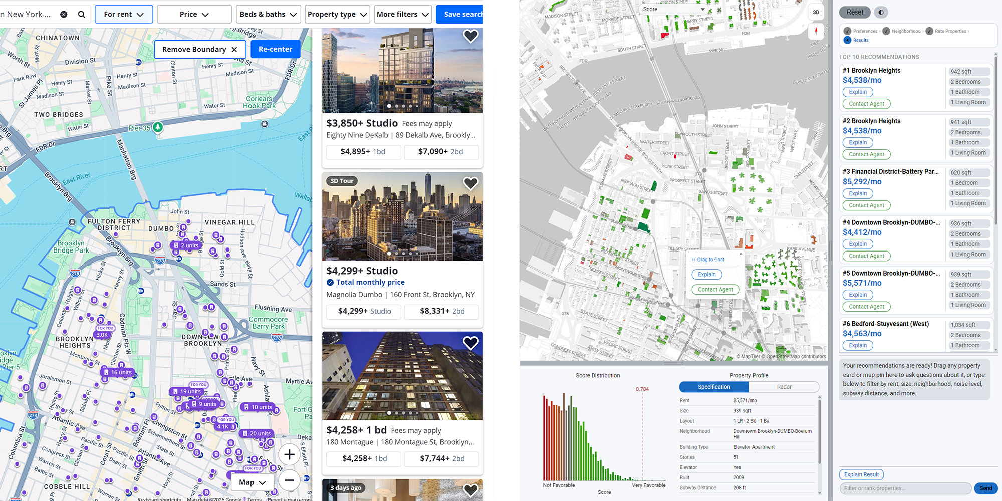
| Zillow · StreetEasy · Redfin | Explorentory |
|---|---|
| Hard filters: price range, beds, neighborhood set before results appear | Trade-off ranking with no filter walls; results always present |
| None, or generic saved search alerts | OLS regression trained live on user's own 10 survey ratings |
| None; user must interpret listings manually | LLM-generated 2–3 sentence narrative per property |
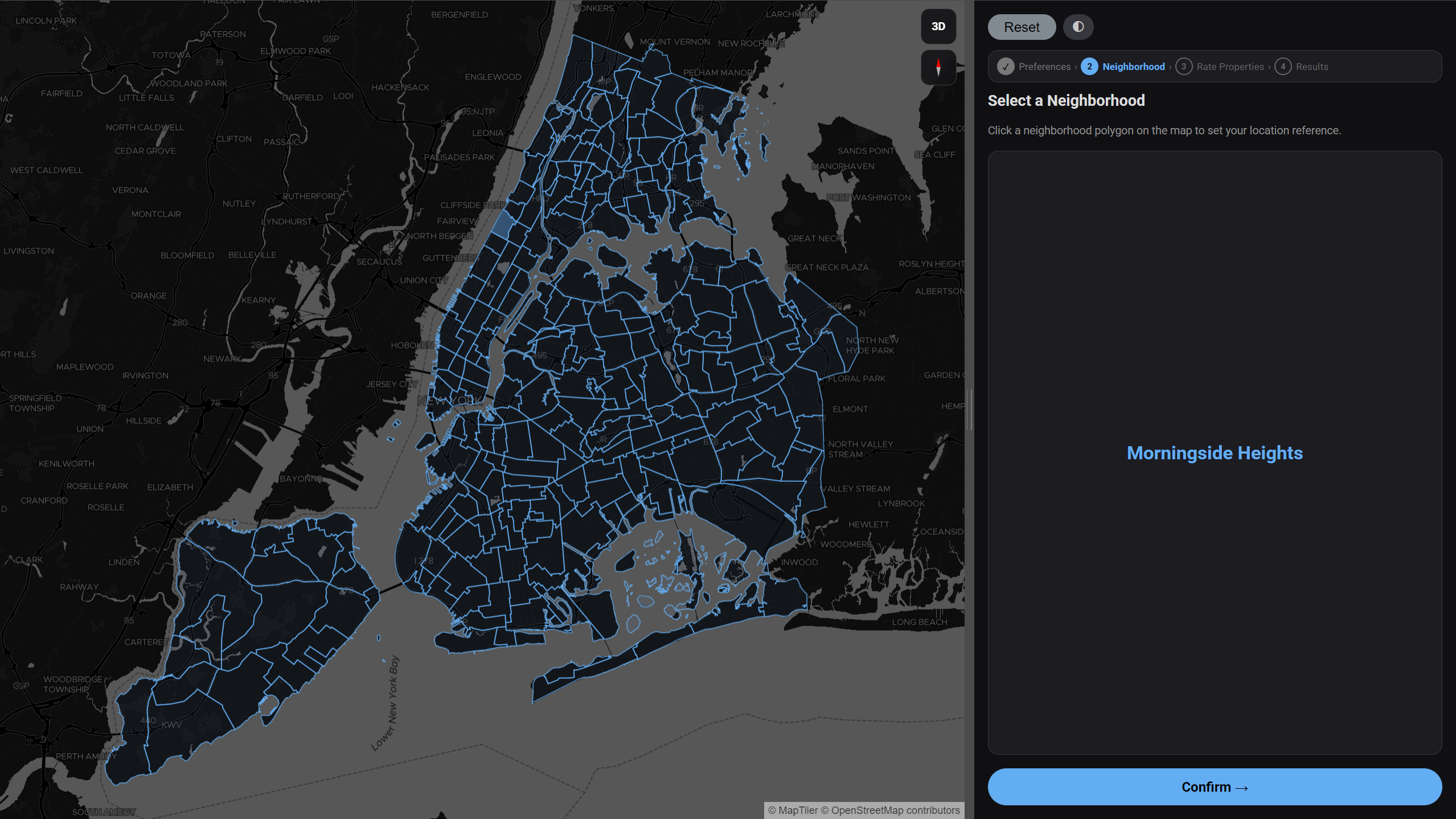
| Dropdown list or typed name search | Click directly on polygon boundaries of a 260-neighborhood live map |
| Listing photos + price, beds, sqft | 9 choropleth modes + histogram distribution + radar chart |
| None | /chat endpoint for natural language filter and sort over live results |
| User must infer trade-offs manually across listings | Radar chart makes multi-dimensional trade-offs explicit |
| None | Survey ratings feed directly into the recommendation model each session |
| Actual live listings (sparse, uneven coverage) | ~3M synthetic NYC units, dense and uniform across all neighborhoods |
User Experience Pipeline
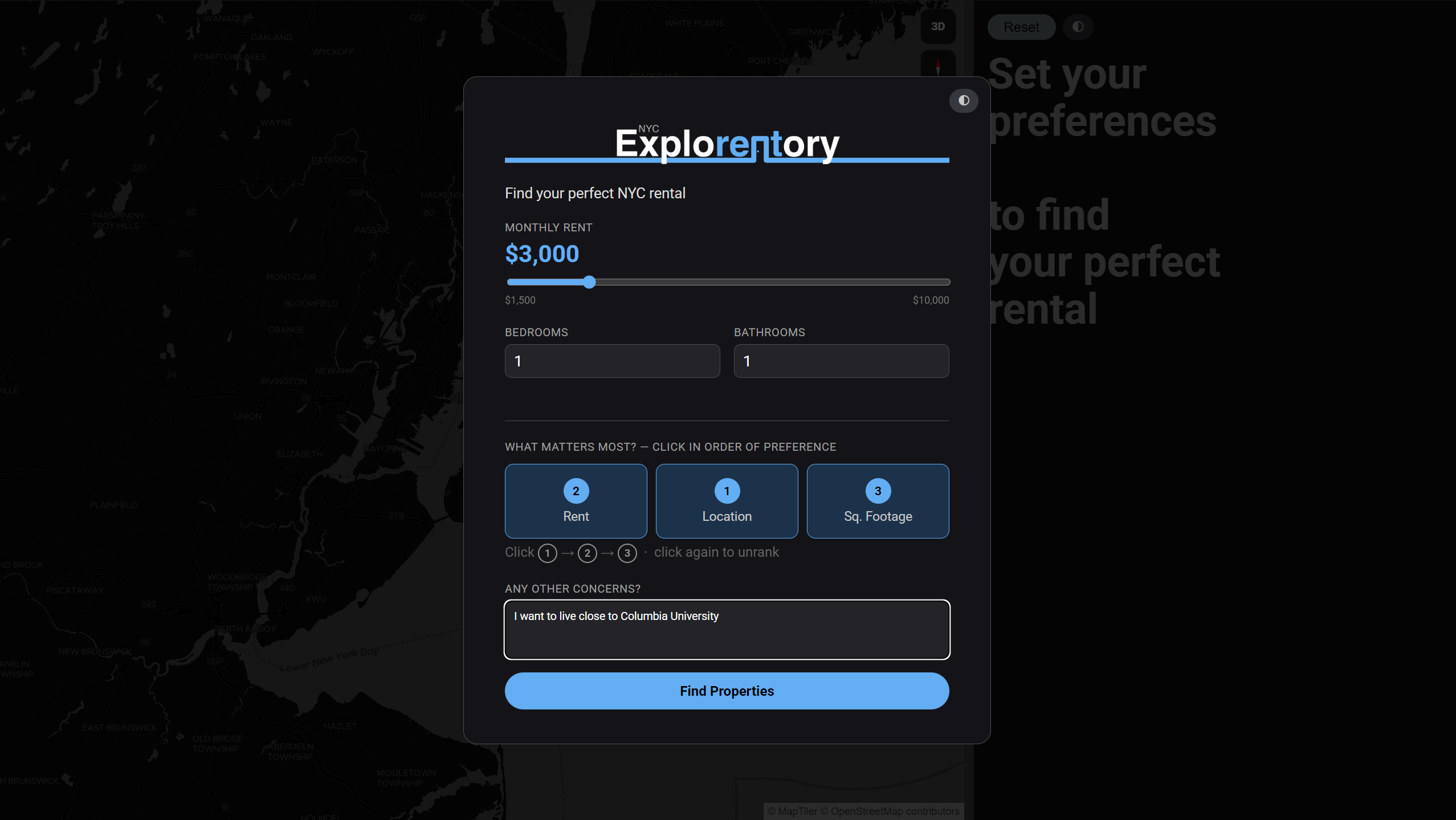
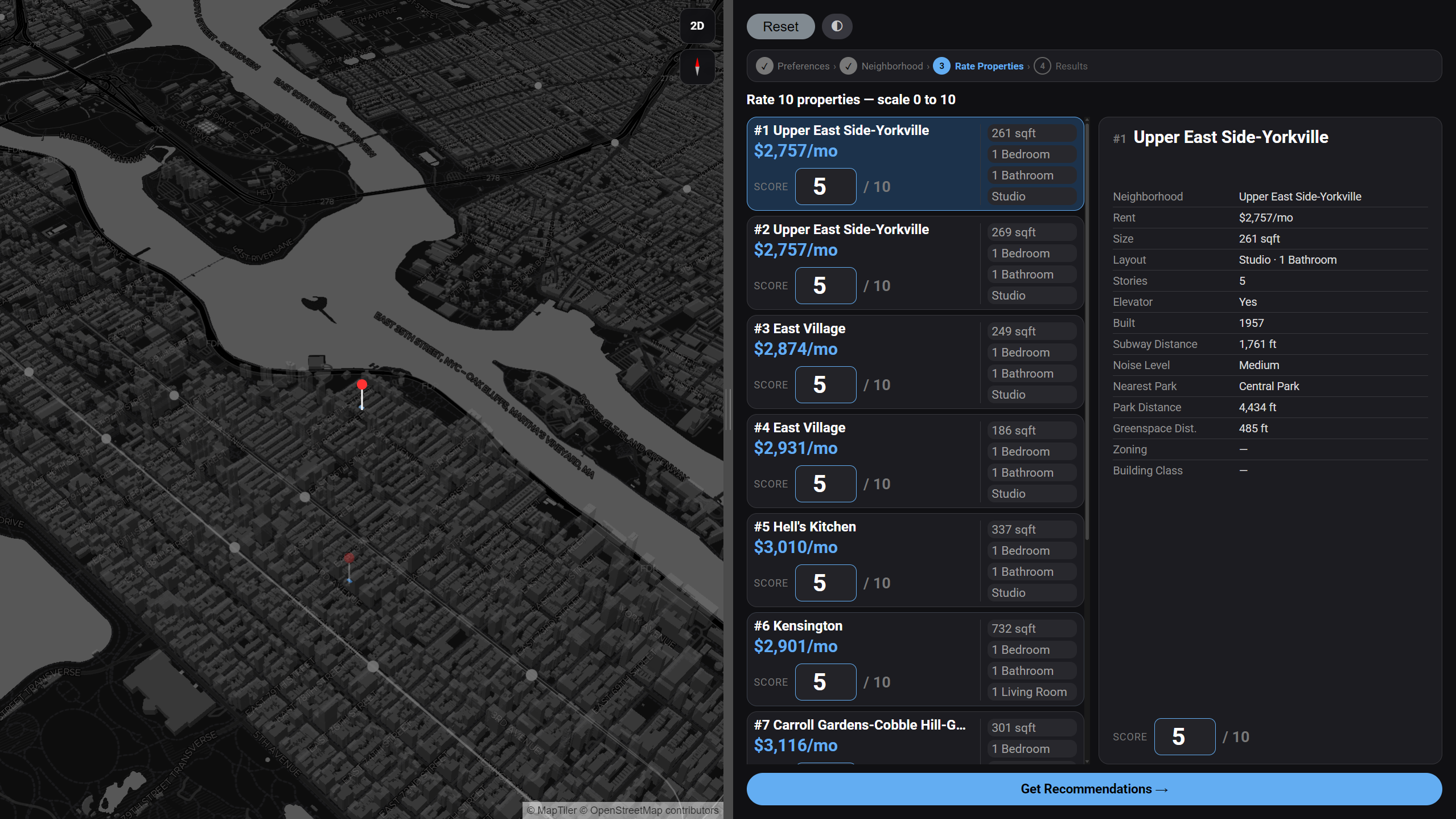
The experience is structured as a four-step guided flow. Each step collects a different layer of preference signal — from explicit numerical constraints, to geographic intent, to implicit behavioral feedback — progressively building the data needed to produce a personalized recommendation.
System Architecture
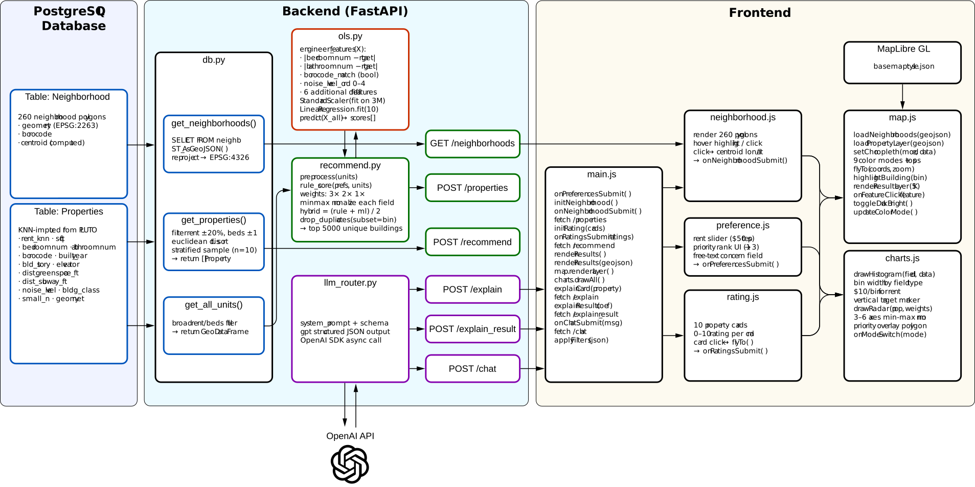
Explorentory is a three-tier system. A PostGIS spatial database holds approximately 3 million property records and 260 neighborhood polygons. A FastAPI backend exposes six REST endpoints: three for data retrieval and ML recommendation, and three for OpenAI-powered natural language features. A Vanilla JavaScript frontend renders results with MapLibre GL and two custom Canvas-based charts, with no front-end framework dependency.
UI Features
01. Natural Language Chat
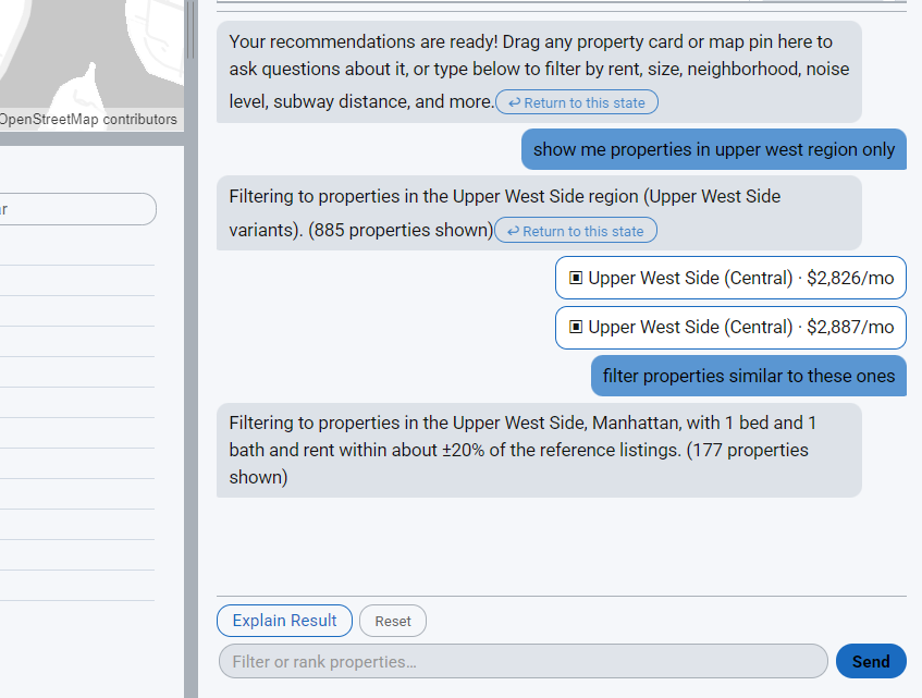
A chat interface at the bottom of the results panel accepts natural language queries against the live result set. The /chat endpoint forwards the user message and conversation history to GPT with a structured system prompt that defines JSON output schemas for filter operations ({"filters": [...], "logic": "AND"}) and sort operations ({"sort": [{...}]}). The prompt embeds mappings for all 260 neighborhoods, building class codes, and all column semantics. The returned JSON is applied client-side, re-ranking the displayed properties without an additional server round-trip. A reset button restores the original recommendation order.
02. Dark and Bright Mode
A toggle button switches the entire interface between dark and bright modes. Each mode has its own complete MapLibre GL style JSON (style.json for dark, style_bright.json for bright), so the basemap, road labels, and water layers all invert as a unit. All nine choropleth color palettes are independently defined for each mode. Canvas charts re-draw with matching foreground and background colors, and property cards update their text and border colors through CSS custom properties. The result is a fully cohesive visual inversion with no partial repaints.
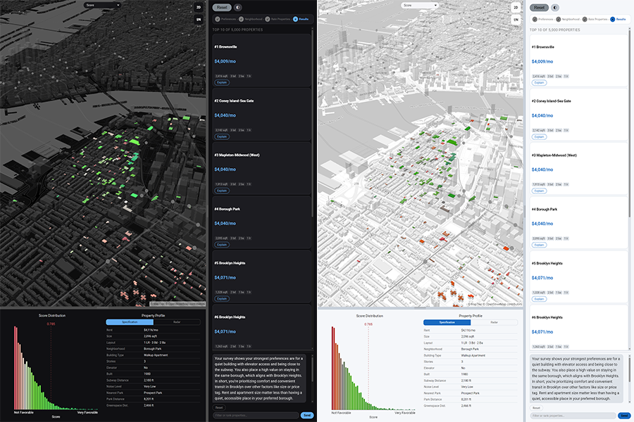
03. Property Cards and AI Explanations
The top-10 ranked results appear as compact cards in the sidebar, each showing neighborhood name, rent, square footage, and bed/bath count. Clicking a card triggers map.flyTo() and highlights the corresponding building footprint polygon on the choropleth. Each card exposes an Explain button that calls /explain, which sends the property attributes alongside the user's original preferences and free-text concern to GPT and returns a 2–3 sentence plain-English match narrative. A separate Explain Result button at the top of the panel calls /explain_result, translating the OLS regression coefficients into a conversational preference summary such as "Your ratings suggest proximity to parks matters more to you than building age."
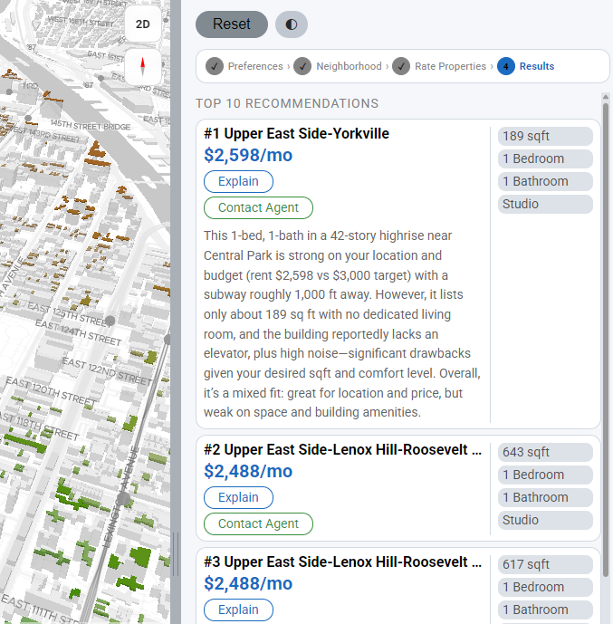
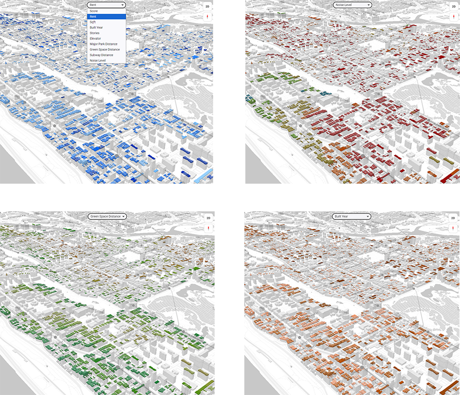
04. Choropleth Mode Selector
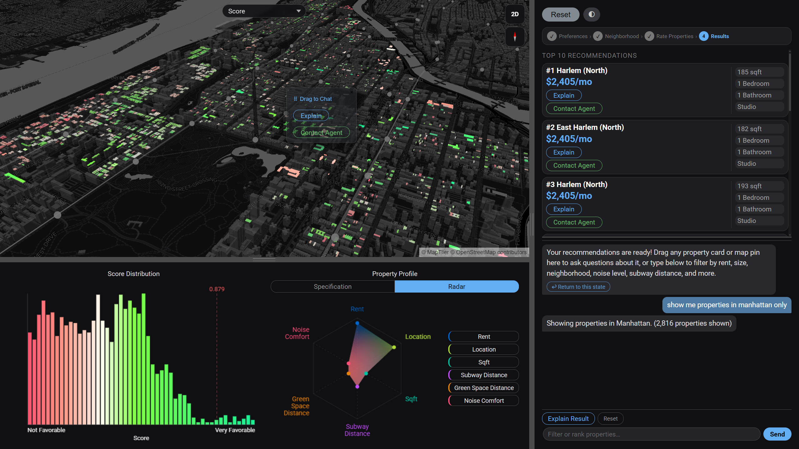
A toolbar above the map lets the user switch the choropleth coloring across nine data dimensions: overall recommendation score, rent, square footage, year built, number of building stories, elevator availability, distance to the nearest park, distance to the nearest subway station, and noise level. Color stops are computed from dataset percentiles so the full spectrum is always used regardless of the value range. Switching modes simultaneously updates the histogram chart to show the distribution of the newly selected field and redraws the radar chart axes to match. The map, histogram, and radar chart therefore always remain in sync with each other.
05. LLM Response Modes
The /chat endpoint classifies every user message into one of five structured response modes. The LLM always returns valid JSON — the frontend inspects which top-level key is present to determine the action. All filtering and sorting happens client-side on the cached GeoJSON, producing near-zero latency results without an additional backend round-trip. The 401-line system prompt encodes the full database schema, all 260 neighborhood names, building class codes, and concept-to-column mappings so the model can resolve conversational terms like "cheapest", "prewar", or "near the park" into precise column operations.
FILTER applies one or more constraints to reduce the property set. Supports ==, !=, <, <=, >, >= with AND / OR logic. An optional limit key caps results to an explicit count or 20% of the set for open-ended similarity queries. Schema: {"filters":[{"column":"...","op":"...","value":...}],"logic":"AND"|"OR","message":"...","limit":N}
SORT changes display order without removing properties. Supports primary and secondary sort keys, mapping conversational terms — "cheapest", "closest to subway", "quietest" — to internal column names (rent_knn, dist_subway_ft, noise_level_ord). Schema: {"sort":[{"by":"...","order":"asc"|"desc"}],"message":"..."}
EXPLAIN returns a 2–4 sentence plain-English answer when the user wants to understand something — what a column means, how the ML score is calculated, why a neighborhood ranked highly — without modifying the displayed list. Schema: {"explain":true,"message":"..."}
CONTACT is triggered when the user signals intent to act — schedule a viewing, make an offer, or reach a broker. Returns borough-specific agent directory information (Manhattan, Bronx, Brooklyn, Queens, Staten Island) with a contextual call-to-action message. Schema: {"contact":true,"message":"..."}
UNCLEAR is used when the request is outside the dataset scope, logically impossible, or ambiguous beyond resolution. Returns a brief apology and a suggested alternative action rather than a malformed filter. Schema: {"message":"..."}
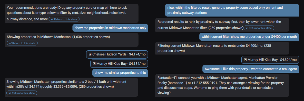
06. Filtering Iteration & State History
Each bot response in the chat panel stores a snapshot of the active filtered GeoJSON at that point in the conversation. When the user applies a new filter or sort, the previous bubble is demoted and gains an inline "↩ Return to this state" button. Clicking it restores that snapshot to the active result set and updates the map, histogram, and radar chart simultaneously — without clearing the conversation history. The chat history is preserved across reverts, so the user can refine forward, revert to an earlier state, and continue refining from there. A top-level Reset button clears all chat history and returns to the original /recommend output.
07. Property Context & Drag-to-Chat
Users can load up to three properties into the chat panel as explicit context for similarity queries. Dragging any card from the top-10 listing sidebar — or clicking a highlighted polygon on the map — adds it as a property bubble in the chat input area. Each bubble displays neighborhood name, rent, and a remove button. When a message is sent with loaded properties, the full attribute set — rent, sqft, bedrooms, bathrooms, building type, subway distance, noise level, borough, and more — is embedded in the LLM prompt, enabling queries like "find apartments similar to this one" or "is this place noisy compared to the others?" The model translates the reference into explicit column-value filters or inline comparisons, applied client-side without a backend round-trip.
Visualization & Charts
Explorentory uses three coordinated visualizations: an interactive choropleth map rendered with MapLibre GL, and two custom Canvas-based charts built without a charting library. All three update in sync when the user switches the choropleth display mode or selects a property card.
Choropleth Map
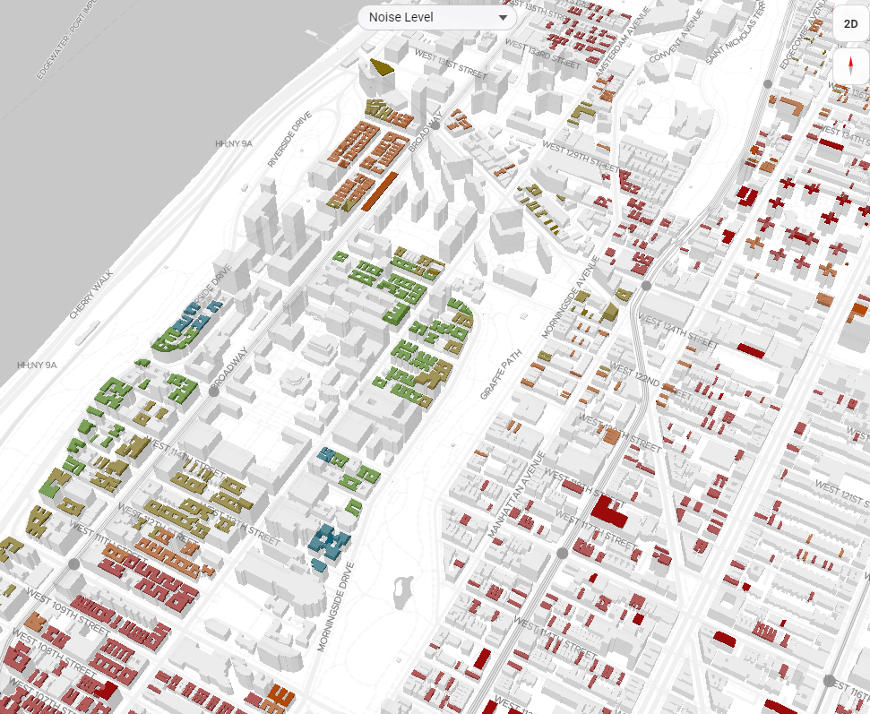
MapLibre GL renders up to 5,000 recommended properties as a WebGL choropleth layer. Nine data dimensions are available: recommendation score, rent, sqft, year built, stories, elevator presence, park proximity, subway proximity, and noise level. Color stops are derived from dataset percentiles so contrast is consistent regardless of value range. Clicking any polygon highlights the matching property card in the sidebar.
Histogram
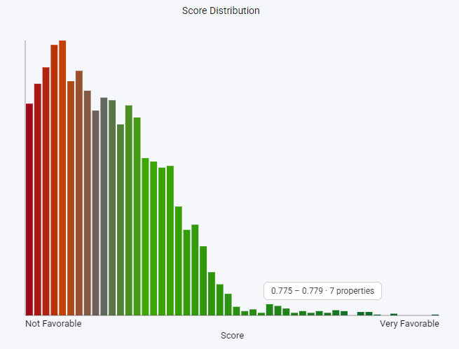
Shows the distribution of the active choropleth field across all 5,000 results. Bin width adapts per field: $10 per bin for rent, 50 sqft per bin for floor area. A vertical marker at the user's stated target value makes it immediately visible whether the result set centers on the stated preference or skews toward trade-offs. Redraws automatically when the choropleth mode changes.
Radar Chart
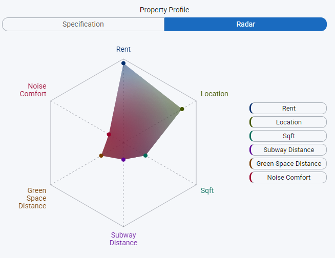
A multi-axis polygon chart with a configurable number of dimensions: Rent, Location Distance, Sqft, Subway Distance, Green Space, and Noise Level. Each axis is min-max normalized across the full result set. One polygon represents the user's stated priority weights; a second overlay shows the selected property's actual profile, making multi-dimensional trade-offs legible at a glance instead of buried in a list of numbers.
Machine Learning Model
The recommendation engine combines a deterministic rule-based scorer with an OLS regression model trained in real time on the user's survey ratings. With only 10 training samples and 11 features, careful feature engineering and global scaling are essential to prevent overfitting.
Feature Engineering
Raw property attributes are converted to user-relative differences before training. For example, bedroomnum becomes |bedroomnum − target_bedrooms|, aligning the feature with what the user actually cares about (deviation from their preference) rather than the raw count. borocode_match is a binary flag indicating whether the property is in the user's chosen borough. All 11 engineered features are scaled with a StandardScaler fit on the entire 3M-record dataset, providing stable mean and variance that do not shift with 10-sample noise.
rule_score = Σ weight[i] × normalize(feature[i], direction[i])
ML Score (OLS prediction rescaled to [0, 1])
ml_score = (OLS_prediction − min) / (max − min)
Final Hybrid Score
final_score = (rule_score + ml_score) / 2
Design Rationale
The hybrid approach serves two purposes. The rule-based component ensures predictable, interpretable behavior that respects user-stated priorities even when the ML signal is noisy, which is inevitable with only 10 training samples. The ML component captures implicit preferences that the user never explicitly stated: a consistent preference for newer buildings, quieter streets, or larger units that emerged from rating behavior. Averaging the two scores prevents either component from dominating and produces a more robust, balanced final ranking. OLS coefficients are passed to /explain_result and translated into natural language, giving users a legible account of what the model learned from their feedback.
Technical Stack
| Layer | Technologies |
|---|---|
| Frontend | Vanilla JavaScript · MapLibre GL 3.6.1 · Canvas API (custom charts) |
| Backend | FastAPI 0.121.2 · Uvicorn · Python 3.12 |
| Database | PostgreSQL 16 · PostGIS (spatial extension) · EPSG:2263 → EPSG:4326 |
| Machine Learning | scikit-learn 1.7.2 · OLS LinearRegression · StandardScaler |
| Geospatial | GeoPandas 1.1.1 · Shapely · Pandas · NumPy |
| LLM Integration | OpenAI SDK · GPT with structured JSON output (3 endpoints) |
| Data | ~3M synthetic NYC units (KNN-imputed from PLUTO) · 260 neighborhood polygons |